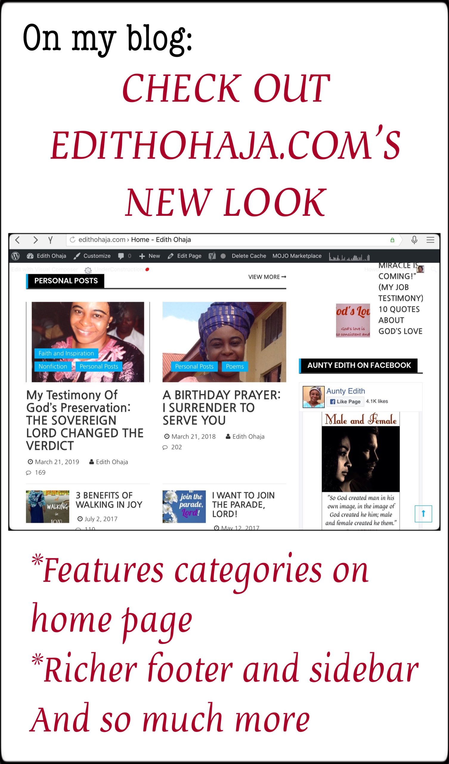
CHECK OUT EDITHOHAJA.COM’S NEW LOOK
For a long time, I’ve longed to redesign my blog but it wasn’t possible until recently. I’m glad to announce though that I finally got help and after a long period of consultation to ensure we got the look and features I love, edithohaja.com has a pleasantly different appearance. For example, you will notice the following:
*Many categories are featured on the home page
*The footer and sidebar are richer
And so much more.
This is my view, so I request that you visit the blog and navigate between the home page, categories and specific posts to see the new look. Do tell me what you like and what you don’t like about it. For example, the banner isn’t quite colourful but I still prefer it to the old one. Nothing we’ve done so far is cast in stone, so I welcome suggestions.
A big bouquet of thanks to frateemedia.com for the hardwork on this project and patience with my numerous and changing requests. You can reach them via their hyperlinked name on the footer of the home page.
I look forward to hearing from you. And do help me share this post widely. Thank you and have a fantastic new year!


I like the changes although am still trying to find my way around.
Well done ma!
There’s a lot of stuff on the home page but the arrangement is pretty simpke and orderly. Enjoy!
I Love it, looks more colourful and very new ? can’t wait to get used to it ??❣
Thank you, Gloria. I love the new home page especially. It contains sommany new features. Happy new year!
Congratulations, Ma for upgrading your blog. The designers were fairly good with the design(The pages are clean and organized, hence, makes readability quite easy. The typography too is much appreciated. Then, the footer design as add-on to the blog is quite commendable too. The readers would have so much to learn navigating through. Well done, Ma. And a happy new year to you.
I like the fact that this theme offers more navigation options than the previous one. Thanks a lot for the feedback, Victor, and have a beautiful new year!
The new outlook is really awesome, And beautiful too. Congratulations ma’am. God bless you
I’m glad you like it. Thanks a lot, Maryann!
Congratulations, Prof. for upgrading our blog.
Praise God, Iheanyichukwu! Hope everything is fine with you. God’s grace in your job!
Aunty to be honest, I think it’s a perfect blog! The home page is awesome! The layout is really good and it retains that simplicity that’s characteristic of edithohajablog. It is colourful enough to make for catchy graphics but not too colourfied.
I checked the non-fiction category of the blog and it’s continuous with the blog, it didn’t feel any different from the the rest of the blog. I read the story about the “Hollywood Jesus”, of course, it was an interesting story as usual.
Nothing has changed in the comment section (in my observation).
However, I noticed that when viewed on a PC, there are some large empty spaces on some of the pages (I didn’t see them on the phone when I checked with my phone). I don’t know why the space is that much though.
My overall experience of the blog is wonderful. The new homepage is much cleaner than the former. The blog, notwithstanding the few changes, retains it’s uniqness, (the “Ohajaness” ? of the blog remains untouched). It’s somewhat like comparing a version of Android with it’s immediate predecessor.
Keep up the good work, aunty!
Awww, thanks a lot! About the white space, it seems too big on the bigger system. Doesn’t look so big on my tablet. The developer said the theme works better with the same size of picture for each post and since the pix aren’t all equal, it creates the white space. Doesn’t make sense to me. The former theme I used had specific size of the featured image and text it would allow on the home page and categories, so no matter the actual size of the image, it didn’t matter. The developer fixed that problem to my satisfaction on the home page, perhaps I should ask him to take a look at the categories. Thanks a whole lot once again.
This is beautiful! ?
Congratsssssssss Ma’am! I like the font used here. It’s user friendly. I tried opening your website on google chrome using a laptop but it didn’t work. I’ve tried several times
Maybe it’s network trouble. I can’t think of any other reason why you’ve had trouble with it. Cheers!
I love it I can easily exit and return to the exact page I was on ,which was previously difficult. Congratulations on the new look.
Finally!
It’s now easier to drop comments…time to put up comments on Aunty Edith’s intellectual posts back to back
#NoTime2Waste
???
I like the new design, it’s unique and easy to navigate. Welldone ma
I love the way the blog was redesign and it makes it easier to navigate.